PurO3
identity
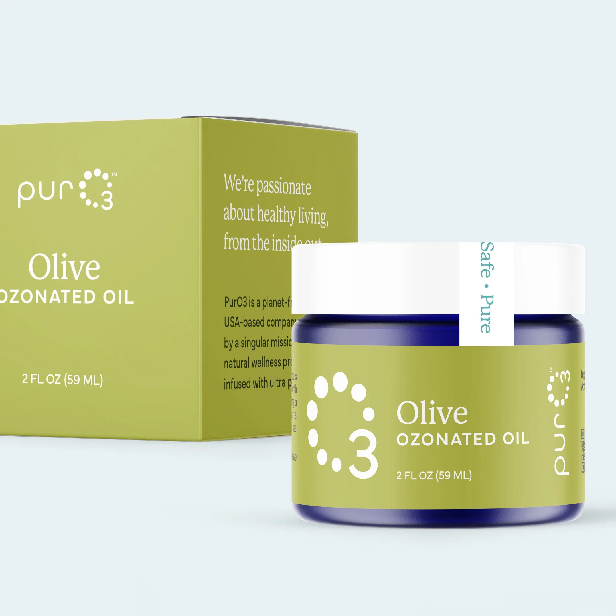
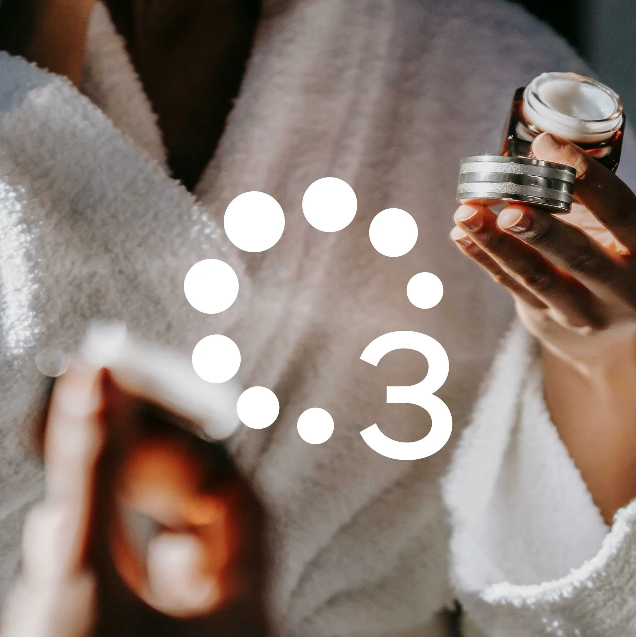
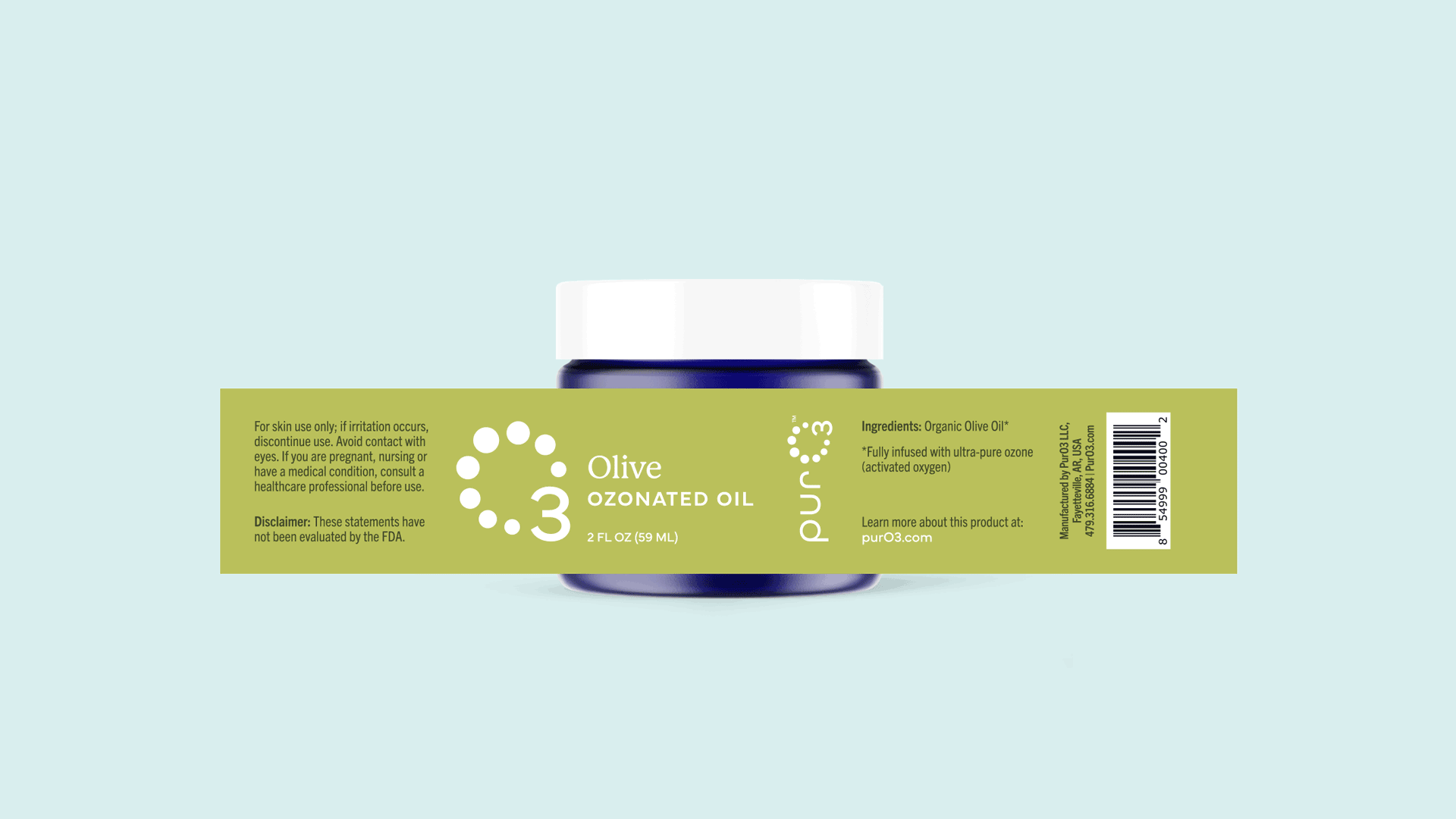
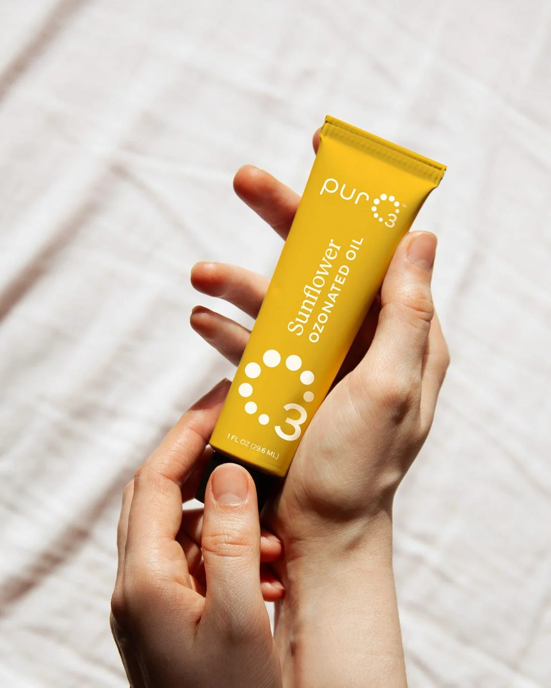
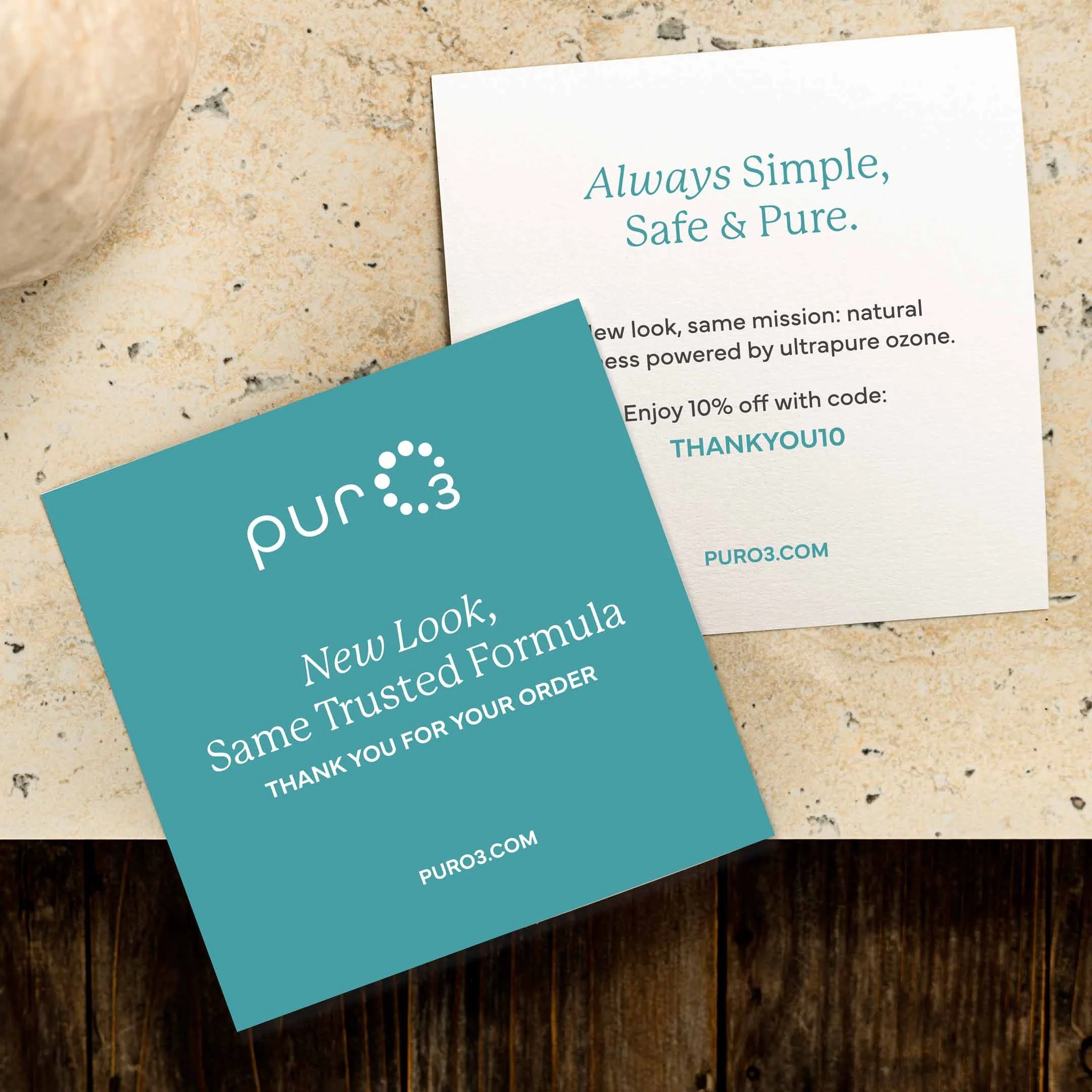
PackagingRefresh and reimagine the identity for PurO3, a wellness brand aiming to broaden and educate their audience about the benefits of activated oxygen skin care.
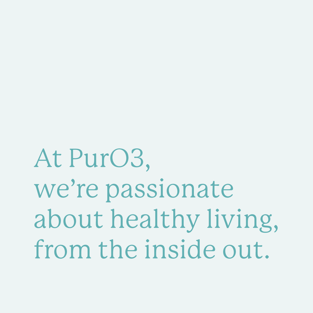
objectivePurO3, a thriving wellness brand, tasked our team with refreshing their logo and packaging system to better serve their online store. I refined the logo to improve legibility, balance, and flexibility across digital, web, and packaging platforms, preserving the recognizable identity their audience knows and loves. A bright, energizing color palette and thoughtful font selection creates a cohesive pairing that’s clear, functional, and versatile across applications. The result maintains PurO3’s familiar personality while giving it a fresh appeal to attract new audiences.
Created in collaboration with my team at Archetype.
overview